A dataset can be examined in a variety of ways. One of the most often utilized strategies among the various options is exploratory data analysis. In layman’s words, the procedure is extracting specific data points from a dataset and creating graphs. These graphs are then visually analyzed for trends and patterns. The visualizations also aid in the verification of assertions or conclusions, allowing for faster decision-making. The following are the results of these choices:
- Business decisions based on data
- Data processing and consumption decisions.
Explaining the Importance of Exploratory Graphs in Data Analysis
Exploratory graphs or visualizations aid in the visualization of data. Individuals can grasp aspects of the data by looking at a single photo rather than having to read through the data manually, which may take hours! This stage also serves as a prelude to decisions such as what kind of models may be constructed, how existing data can be handled, and what types of business issues can be addressed through data comprehension.
Analyzing data in an exploratory manner
The most popular languages for data analysis are Python and R. Python is the most popular programming language among programmers, mainly to the availability of simple third-party libraries like pandas, seaborn, and matplotlib.
We’ll use the packages described above to investigate the data in Kaggle’s Titanic- Machine Learning from Disaster dataset. To obtain a sense of how the data appears, we display the first few rows of the dataset in the first phase.

The following step is to print each column’s data types. Strings are stored in the object columns, float values are stored in the float columns, and numbers are stored in the int columns.

If you’re not sure what any of the columns mean, here’s a table from Kaggle’s website that explains them better

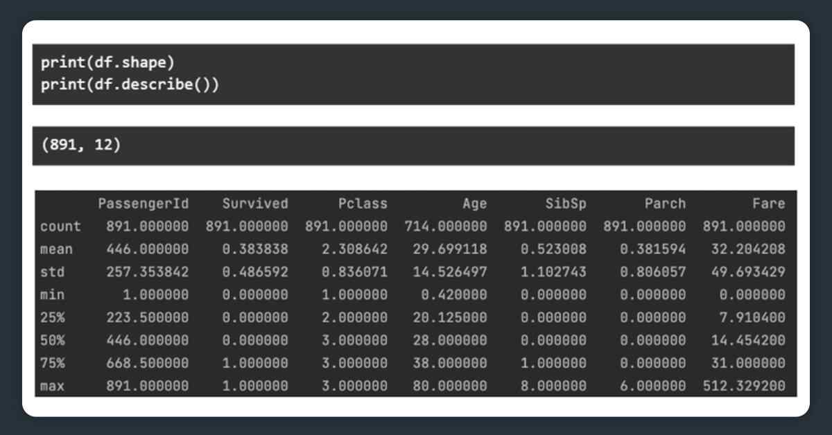
To go further into the data, we look at the data’s form – the number of rows and columns. We also publish the most important statistical data points for each numerical column.
The Empty percentage of data is a significant component of these databases. For each column, we report the number of null entries.

You may use something like the code below to eliminate all the rows where a certain column has an empty value. We just delete all the rows with an empty ‘Age’ column.

The next stage is to create visualizations using various combinations of columns from the dataset. We’re going to –
- The examination of a single column is known as univariate analysis.
- The Two-column analysis is known as bi-variate analysis (usually one vs another).
- Analysis of three or more columns is known as multivariate analysis.
So, what function do exploratory graphics play in this data analysis? Based on our dataset, we can see how many people of each age group boarded the Titanic in the first scenario.


Then we graph the age vs. surviving graph and see that a person’s age had no bearing on whether or not they survived the disaster.


We graph the price vs. ticket class and find that, while first-class tickets are more expensive in some cases, all tickets may be purchased for a low price (probably if bought early on). However, the costs of 3rd and 2nd class tickets are nearly the same.


The sole multi-variate graph in this investigation is Age versus SibSp and parch, which led to the conclusion that younger people had a larger likelihood of having more siblings, resulting in a higher SibSp. The prevalence of parch increased with age, most likely as a result of people having children. The majority have a Parch of 1 or 2, suggesting the existence of one or both parents.


When the number of people who survived is plotted against the number of people who died, the number of people who survived is almost the same throughout the classes, however, the number of people who died is highest in the third class.


When we plot gender against survival in the last graph, we see that women have a higher percentage of survivors than males. This may be because women were urged to join lifeboats first.


The exploratory data analysis method may appear to be a mess of black markings on a page, but visualizations assist to reveal the data’s beauty and wonder. This is why data scientists and analysts rely on exploratory analysis as their primary method of data analysis. Before constructing data pipelines or ETL systems, this is done. Visualizations make it easier to digest data, regardless of the source of the problem statement at hand.
Looking for web data scraping services?
Contact X-Byte Enterprise Crawling today!
Request for a quote!
 ✯ Alpesh Khunt ✯